

Valley Health Center: Pattern, Shadow, and Scale
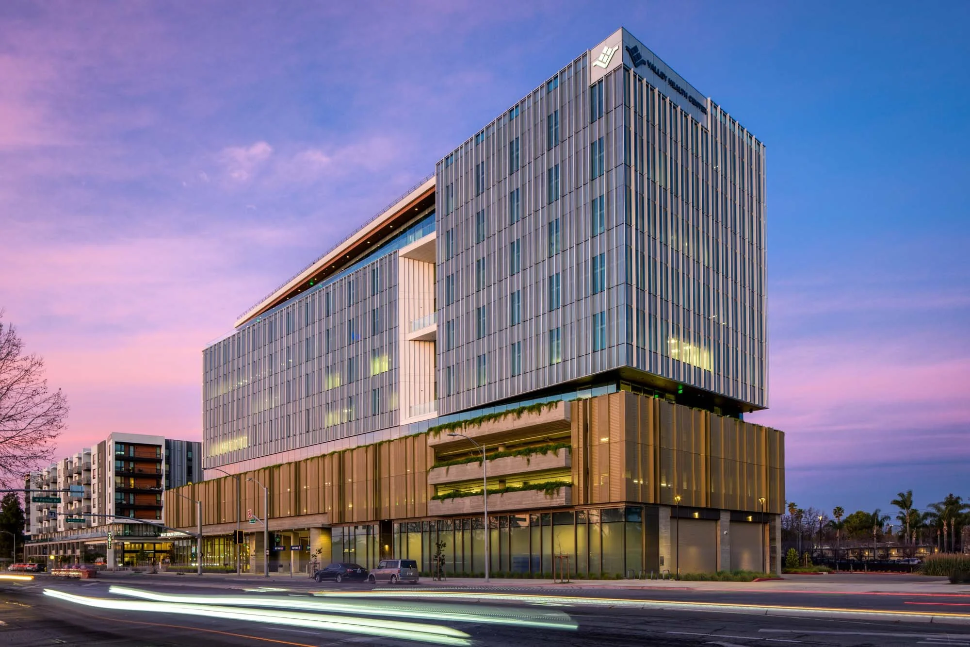
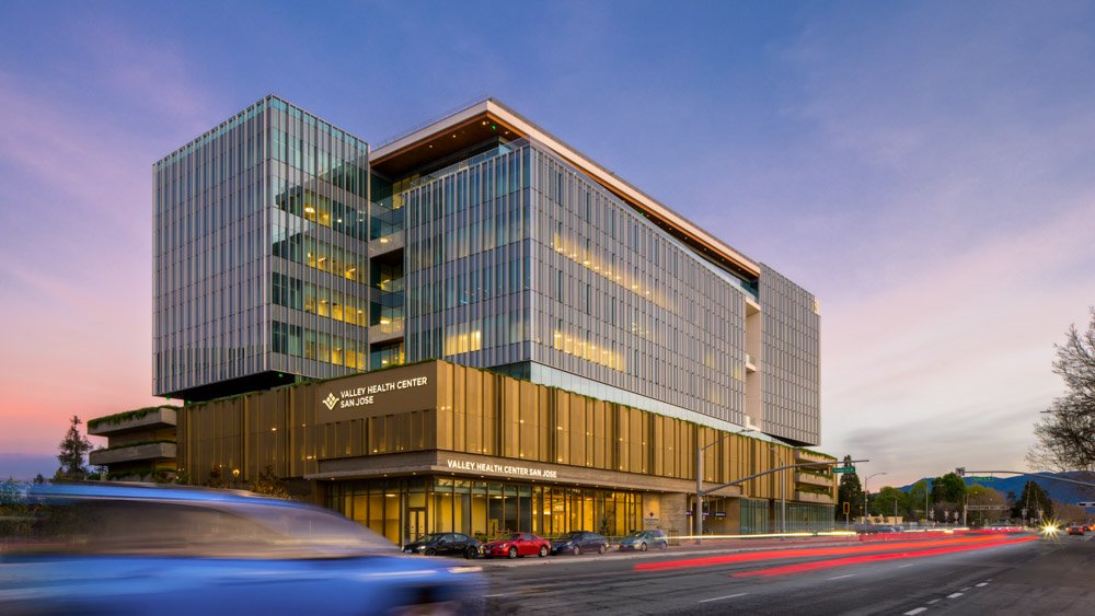
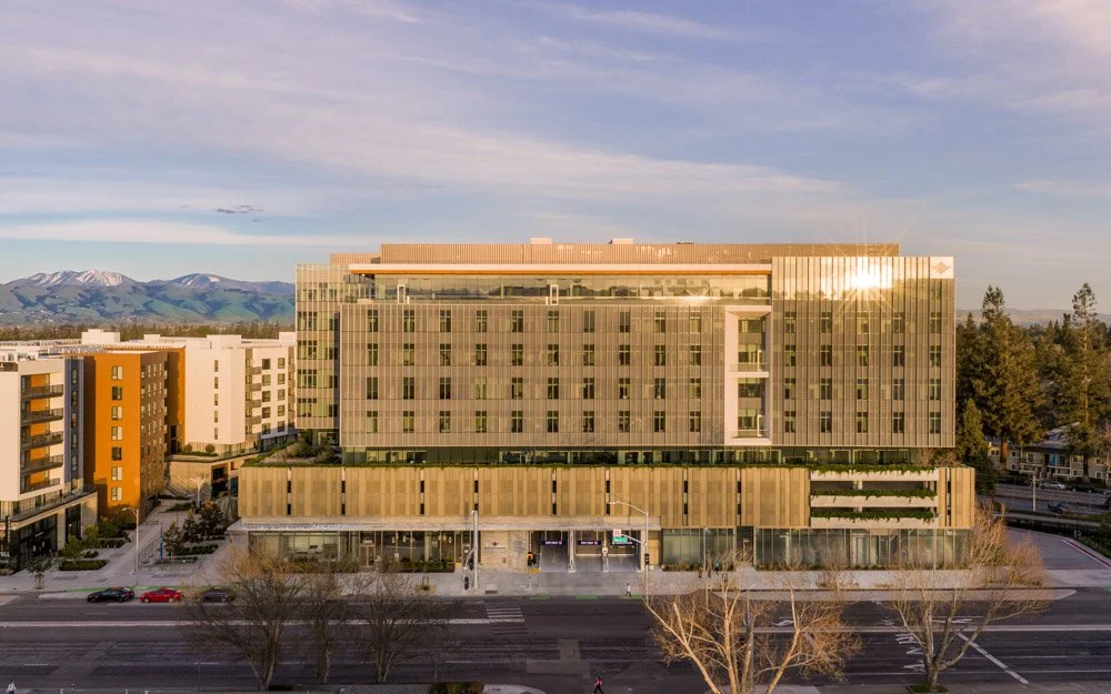
Valley Health Center in San Jose pairs a glass medical tower with several levels of parking along Bascom Avenue. The tower is the tallest part of the building, but the parking podium takes up much of what people see from the street and nearby homes.
The design team used a perforated aluminum screen to give this large base a stronger architectural presence. The screen hides much of the concrete structure while still letting daylight and fresh air reach the parking levels.
For the photography, I focused on how pattern, depth, and changing light shape the façade. Shooting from golden hour through dusk gave me a chance to show both how the system works and how its appearance changes over the course of the evening.
Project Overview
Project: Valley Health Center San Jose
Project Type: Healthcare
Building Type: High-rise outpatient medical center with structured parking
Location: San Jose, California
Architect: WRNS Studio
General Contractor: South Bay Construction
Key Partners: Valmont Industries, Inc. — perforated façade system and photography commissioning client; Griggs Systems — architectural product representative for Valmont, Morin, and Parklex Prodema; B.T. Mancini Co., Inc. — façade installation; Walters & Wolf — curtain wall; Parklex Prodema — wood-veneer cladding; Rieder — GFRC cladding; Morin — roof-screen metal panels
Photography Scope: Exterior ground-based and aerial architectural photography
Photographer: Rob Calderwood Architectural Photography (San Francisco Bay Area)
Design Story
The parking podium stretches across much of the lower part of the building. If left open, the concrete parking decks would have been one of the project’s most visible features.
The perforated aluminum screen gives the podium a cleaner and more unified face. Its rectangular openings let daylight and fresh air pass through while softening views into the parking levels.
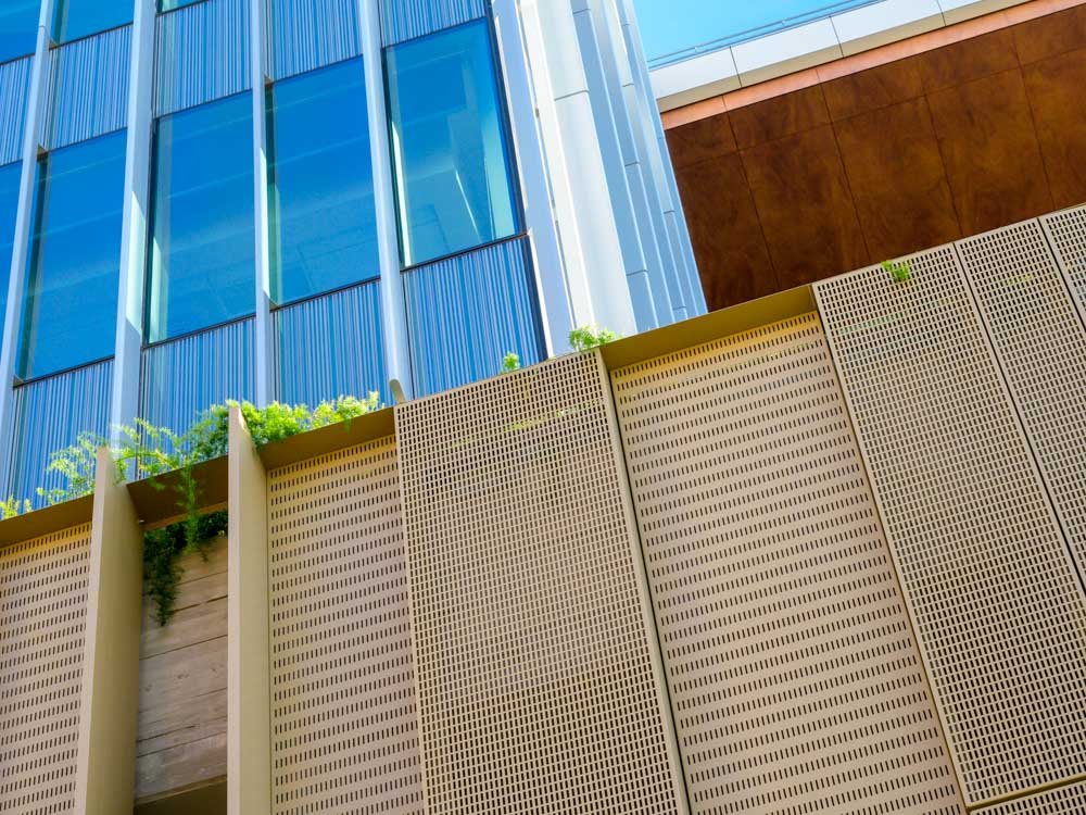
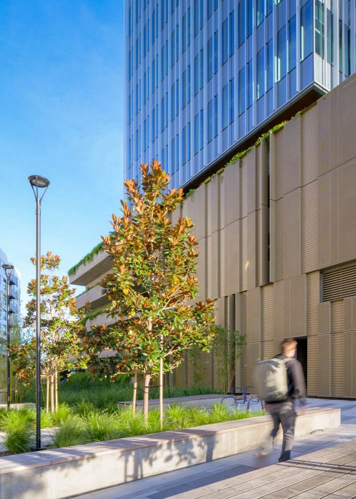
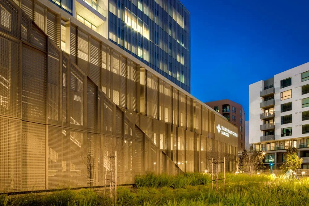
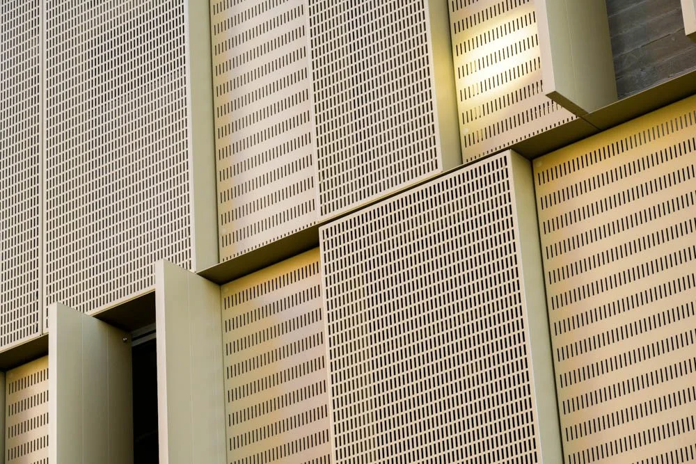
The façade also has more depth than it may seem to have at first glance. Panels sit at different depths, and fins project from the face at set points along the elevations. These shifts create shadow and keep the long walls from feeling flat.
This is especially important on a building of this size. The changes in depth help break down the scale of the podium and make it feel more suited to the street and nearby homes.
The warm metal finish also sets the base apart from the glass tower above. During the day, it can read as champagne gold. As the sun goes down, it takes on a deeper bronze tone. That shift became a key part of the photo story.
The panel system does several jobs at once. It screens the parking structure, lets in air and light, gives the base a clear identity, and ties a very large building more closely to its setting.
Constraints & Opportunities
The main photo challenge was scale. The building needed wide views to show how the podium and tower work together. At the same time, those views could not fully explain the panel pattern, changing depths, or projecting fins.
Closer views were needed to show how the façade works. Wider ground and aerial views were needed to show what it does for the building as a whole.
The final set needed to cover several parts of the story:
Overall form: How the podium creates a base for the glass tower
Façade pattern: How the rectangular openings repeat across the long walls
Depth and shadow: How the panels and fins keep the elevations from feeling flat
Practical use: How the screen hides the concrete while allowing light and air into the parking levels
Material contrast: How the warm metal works with the cooler glass above
Site context: How the building meets Bascom Avenue and the nearby neighborhood
Changing light: How the color of the metal shifts as day moves into dusk
The short period between golden hour and dusk made timing important. Earlier light brought out the pattern, fins, and panel depth. Later light brought out the richer bronze color and made the lit parking levels more visible behind the screen.
The weather added something unexpected. Snow-covered Mount Hamilton appeared behind the building in several views, along with a colorful dusk sky. These conditions gave the images a strong sense of place without taking attention away from the project.
How We Approached the Shoot
I planned the shoot around the light. The goal was to work through a clear order, starting with views that needed more daylight and ending with those that would be strongest at dusk.
The earlier part of the shoot focused on showing the façade system clearly. Ground-level views helped show how the podium feels from the street. Angled views made the changing panel depths and projecting fins easier to see.
A straight view can show the overall pattern, but it can make a layered façade look flat. Shooting from an angle helped bring out the overlaps, shadows, and changes across the face of the building.
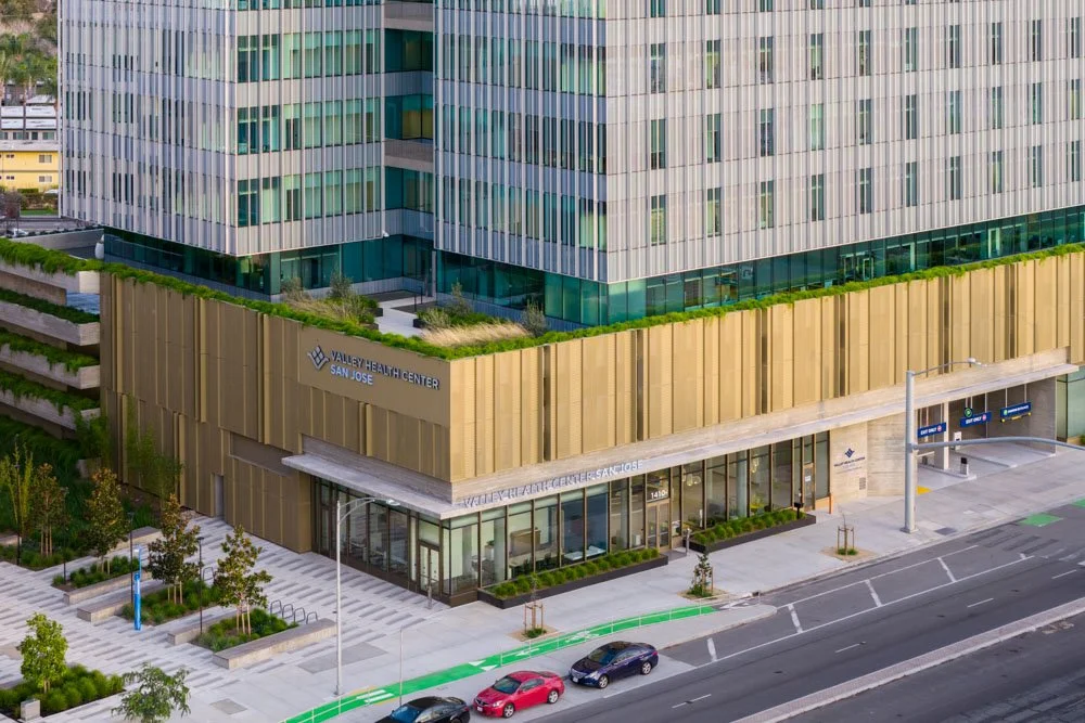
The aerial views added another part of the story. From above street level, the full size of the podium becomes easier to understand. These views also show how the building sits along Bascom Avenue and how the screen helps the large medical center relate to the blocks around it.
As the light faded, I shifted toward the warmer dusk views. At that point, the metal took on a deeper bronze color, and the light behind the perforated panels helped show that the screen remains open.
The final set moves through several scales: the building in its setting, the tower and podium together, the full façade, and the panel system in closer views. This range gives the client both strong lead images and more detailed photos that help explain the product.
Image Highlights
The tower-and-podium views show the main design relationship. The glass tower rises above a broad metal base, with each part using a very different material and sense of weight.
The angled ground views bring out the depth of the façade. From these points, the fins overlap with the perforated panels and cast stronger shadows across the surface.
The wide elevation views show how the panel pattern carries across the long parking levels. The repeated openings give the façade order, while the changes in depth keep it from reading as one flat wall.
The aerial views show why the screen matters at the scale of the full building. They make the size of the parking podium clear and show how the metal façade gives it a more finished presence along the street.
The dusk views with Mount Hamilton became some of the most distinct images from the shoot. The snow-covered ridge and evening sky place the project in the South Bay, while the warm light brings out the bronze tone of the façade.
Results & How the Client Uses the Images
The final image set shows the façade in two ways: as part of the architecture and as a working panel system.
Wide views show how the screen shapes the base of the medical tower. Closer views show the perforations, panel depth, fins, finish, and the way light passes through the system.
For the manufacturer, this mix is useful because the images can support project profiles, product marketing, proposals, presentations, and sales work. Architects and builders can see how the system looks on a large project, while closer views give them a better sense of the design and panel layout.
The range of lighting also gives the client more choice. Daylight views are clear and useful for showing the building and façade details. Dusk views have a warmer mood and work well as lead images for websites, social media, presentations, and editorial use.
A good project image library needs to do more than provide one strong hero image. It should give the client enough range to tell the full story across many types of marketing without having to explain the project from scratch each time.
You can view more work in my architectural photography portfolio or learn more about my architectural photography services.
If you are wrapping up a healthcare, commercial, or façade project in the Bay Area and need publication-ready photography, you’re welcome to reach out through contact or check my availability.
Key Takeaways
Design: The perforated aluminum screen gives the parking podium a clear architectural identity.
Performance: The openings bring daylight and fresh air into the parking levels while screening the concrete structure.
Scale: Changing panel depths and projecting fins help break down the long elevations.
Material: The warm metal base stands apart from the cooler glass tower above.
Photography: Ground and aerial views show the façade from the street, across the full building, and within the wider site.
Light: Shooting from golden hour through dusk shows the finish shifting from champagne gold to bronze.
Context: Snow-covered Mount Hamilton and the evening sky give the images a strong South Bay setting.
Use: The final set supports project profiles, product marketing, proposals, presentations, and editorial use.