

45 Fremont: Framing a Timeless Downtown Presence
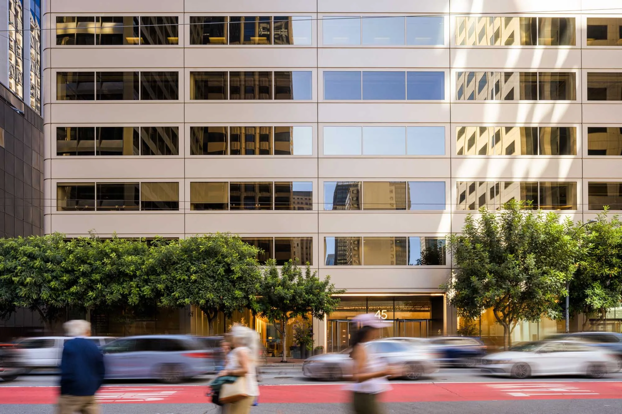
Some buildings command attention through height or novelty. Others earn it through proportion, restraint, and the way they continue to hold their place in a changing city. Completed in 1978, 45 Fremont belongs to the second group.
Madison Capital commissioned a new collection of still photography and architectural film for the building’s branding and marketing. Working from a creative brief developed by Made Thought, my role was not simply to document the tower. The goal was to create a distinct visual atmosphere through warm light, deep shadows, façade details, timelapse, and views that placed 45 Fremont within the larger fabric of downtown San Francisco.
The resulting work combines ground-based and aerial perspectives to present the building both as an individual architectural presence and as part of a dense, layered skyline.
Project Overview
Project: 45 Fremont Street
Project Type: Architectural Photography + Film
Building Type: High-Rise Office Building
Location: San Francisco, California
Photography Year: 2026
End Client / Owner: Madison Capital
Architect: Skidmore, Owings & Merrill
Key Partner: Made Thought — Creative Direction
Photography Scope: Ground-Based and Aerial Still Photography, Architectural Film + Timelapse
Client Use: Website, Branding and Marketing
Visuals by: Rob Calderwood Architectural Photography
Design Story
Designed by Skidmore, Owings & Merrill and completed in 1978, 45 Fremont is a 34-story office tower in San Francisco’s South Financial District. Its glass-and-aluminum exterior is direct and disciplined, with a consistency that gives the building a quiet confidence.
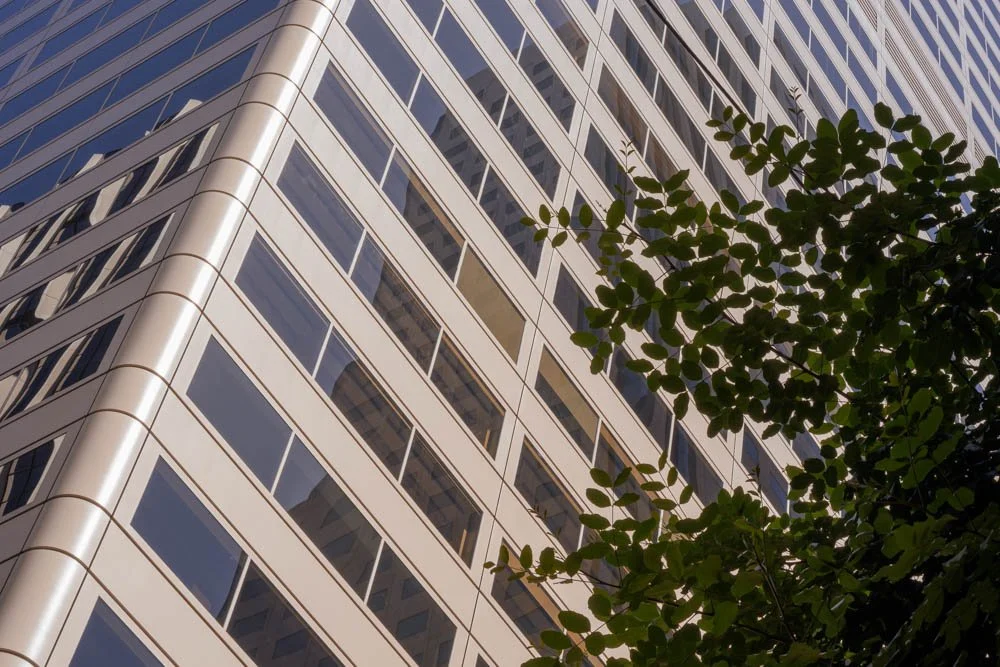
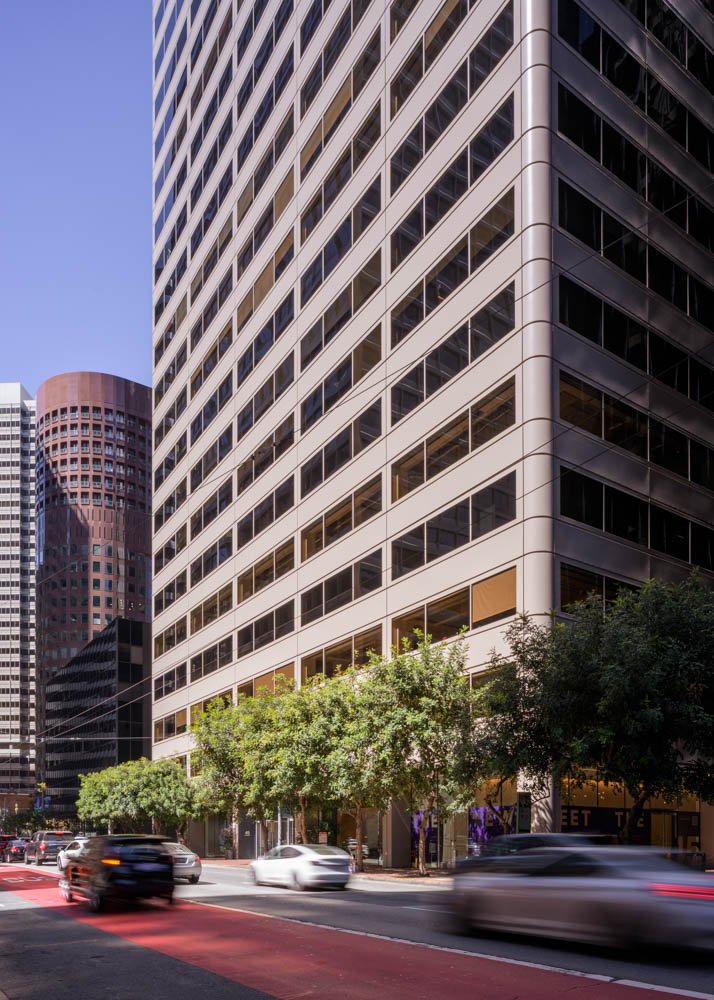
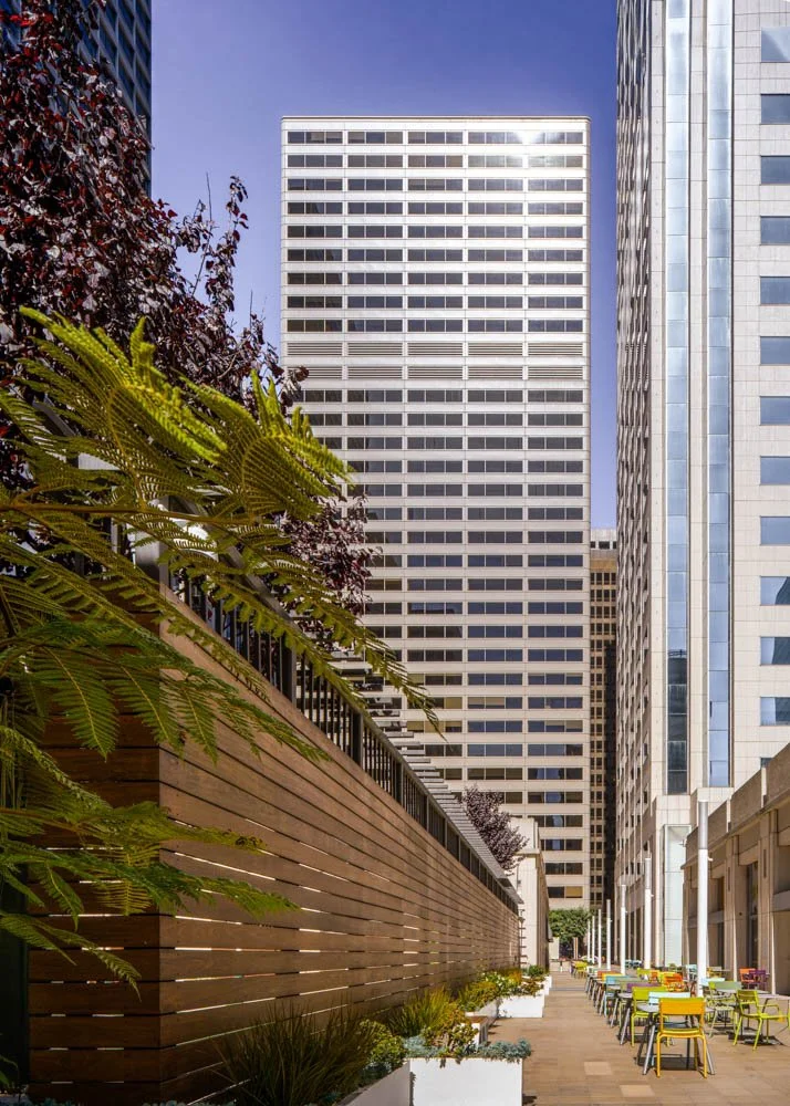
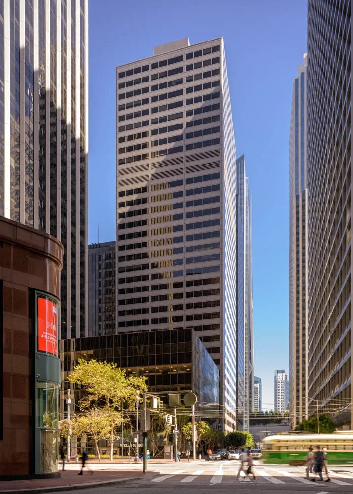
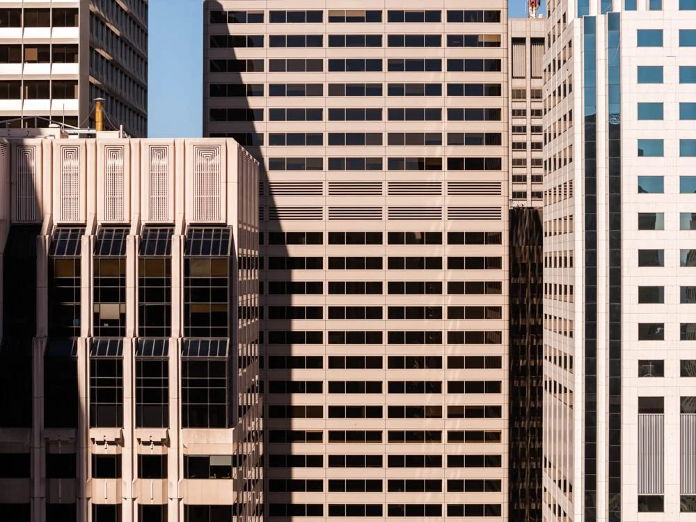
What surprised me most was how little the architecture feels tied to its era. Nearly five decades after completion, the tower still has a simple, handsome presence. It does not rely on an unusual silhouette or highly expressive surface to distinguish itself. Instead, its strength comes from proportion, repetition, and the clarity of the façade.
That restraint became an important part of the visual story. The photography and film needed to show the architecture clearly, but the project was not intended as a conventional design or construction case study. The larger goal was to shape a current identity for the property and show how it belongs within San Francisco today.
Constraints & Opportunities
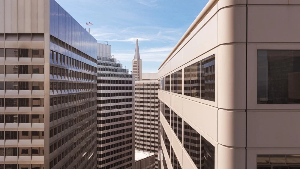
45 Fremont occupies a dense part of downtown, surrounded by buildings from several periods of the city’s development. From many viewpoints, neighboring towers overlap its edges or rise well above it. More recent additions—including Salesforce Tower and Millennium Tower—can easily dominate the skyline.
The visual challenge was to give 45 Fremont a strong presence without pretending it stands apart from that context. Rather than treating nearby buildings as obstructions, I used them as compositional elements. Their different heights, surfaces, and distances helped create layers around the subject.
This approach made the density of the city an opportunity. Wider views could show the tower as part of San Francisco’s evolving architectural landscape, while tighter compositions could isolate its façade, geometry, and interaction with light.
Time of day was equally important. Warm sunlight brought depth to the building’s restrained exterior, while shadows made the façade’s rhythm more visible. The changing light also helped the stills and film feel connected, even though they included views from very different positions and scales.
How We Approached the Shoot
Made Thought’s creative brief established a clear set of priorities: a defining hero image, city context, façade details, urban layering, warm light and shadow, and timelapse. I treated these not as separate items on a checklist, but as parts of one visual system.
Ground-based photography brought the viewer close to the building. These views emphasized its street presence, vertical lines, façade pattern, and relationship to adjacent structures. From this level, small changes in position had a large effect on how much of the tower could be seen and how the surrounding buildings framed it.
Aerial photography and film created a different kind of context. The added distance made it possible to see 45 Fremont within the broader downtown composition and to understand how its scale changes depending on the viewpoint. From some angles it reads as a prominent tower; from others, it becomes one element within a much larger urban field.
The production focused on several connected view types:
Hero views that gave the building a clear and memorable identity
Layered city views that placed it among neighboring towers
Façade details that emphasized repetition, geometry, light, and shadow
Aerial perspectives that established its downtown location and scale
Timelapse sequences that introduced movement through changing light, traffic, and city activity
Using both still and moving imagery also allowed each medium to do something different. The photographs hold individual architectural relationships in place, while the film shows the building as part of an active city whose light, traffic, and atmosphere continually shift.
visual Highlights
The strongest images are not necessarily the ones that separate 45 Fremont completely from its surroundings. Instead, several of the key views allow other buildings to enter the frame, producing a layered urban canvas with 45 Fremont as the visual anchor.
In these compositions, the neighboring architecture provides scale and depth. Older and newer towers overlap, reflecting different phases of San Francisco’s growth. This makes the subject’s understated design more apparent: it remains visually composed even when seen beside buildings with very different forms and heights.
Closer façade studies shift the emphasis from the skyline to the building’s surface. Warm light and directional shadows reveal the order of the exterior and give dimension to a design that can appear very flat under neutral conditions.
The aerial work expands the story again. These views connect the building to the South Financial District and the larger San Francisco skyline, while the film and timelapse sequences show how the setting changes over time. Together, the imagery moves between detail and context without losing a consistent mood.
Results & How the Client Uses the visuals
The final collection gives Madison Capital a coordinated set of still and moving assets for the building’s branding and marketing. Because the photography and film were developed from the same creative brief, they share a common visual language rather than feeling like separate productions.
The range of material also supports different communication needs. Hero images can lead a campaign or establish the property quickly. Façade details offer quieter supporting visuals. Aerials provide location and city context, while film and timelapse bring movement and atmosphere to digital presentations.
Most importantly, the work presents 45 Fremont as it exists today: a late-1970s tower with a lasting architectural clarity, surrounded by a city that has continued to grow upward around it.
For more work examining architecture within the city, explore my San Francisco architectural photography. If you are planning a coordinated still photography and film campaign for a commercial property, get in touch to discuss the project.
Key Takeaways
45 Fremont was designed by Skidmore, Owings & Merrill and completed in 1978.
Its restrained design still gives the building a timeless and confident presence.
The creative direction prioritized warm light, shadows, façade details, city context, hero views, and timelapse.
Ground-based and aerial imagery showed the building at both architectural and urban scales.
Neighboring towers became compositional layers rather than distractions.
Coordinated still photography and film created a consistent visual library for branding and marketing.